How to Read a BTC Candlestick Chart? Patterns, Wicks, and Timeframes

- A Bitcoin candlestick chart displays four data points per candle — open, high, low, and close — giving traders far more information than a simple line chart.
- Green candles mean BTC closed higher than it opened; red candles mean it closed lower.
- The body shows the open-to-close range, while the upper and lower wicks mark the session's price extremes.
- Timeframe selection matters: short intervals suit active traders, while the daily and weekly charts serve longer-term analysis.
- Four patterns — Hammer, Shooting Star, Doji, and Engulfing — form the core of Bitcoin candlestick chart analysis.
- Candlestick patterns work best when combined with RSI and moving averages, not used in isolation.
What Is a Bitcoin Candlestick Chart? BTC Price Chart Basics Explained
Bitcoin Candlestick Chart Anatomy: Body, Wicks, and OHLC Explained
The Candle Body
The Upper Wick
The Lower Wick
How to Read BTC Candlestick Chart Timeframes
Key Bitcoin Candlestick Chart Patterns: Reversals and Signals to Watch
Hammer — Bullish Reversal Signal
Shooting Star — Bearish Reversal Signal
Doji — Market Indecision
Engulfing Candle — Momentum Shift
How to Use Bitcoin Candlestick Chart Analysis in Practice
FAQ
Conclusion
Popular Articles
View More
MEXC On-chain Daily Report: U.S. Imposes 10%–12.5% Tariffs on 60 Economies
Updated: July 24, 2026, 9:30 (UTC+8)|Author: MEXC Headlines The U.S. imposes 10%–12.5% tariffs on 60 economies. Coinbase adds tokenized RWA assets to its balance sheet. ETH staking rises to 33% of

MEXC Alpha Trader Research Weekly | ETFs See Net Inflows for Two Consecutive Weeks as BTC Reclaims $65K: Bottoming Signal or False Breakout?
Week 3, July 2026 Reporting Period: July 15 – July 21, 2026 Data Cutoff: July 21, 2026 Market Overview The crypto market demonstrated resilience this week amidst complex multi-directional pressures.
Tesla Holds 11,509 BTC in Q2 Despite $112 Million Bitcoin Loss
Tesla’s Bitcoin update looks negative at first glance. A $112 million digital-asset loss is not the kind of number investors usually ignore. But the more important detail is quieter: Tesla did not

Hot Crypto Updates
View More
Bitcoin Price Eyes $65,000 as Standard Chartered Backs $100,000 Target: Is the Bottom In?
Key Takeaways Bitcoin (BTC) has rallied from about $61,400 on July 6 to an intraday high of $64,653 on July 10 and trades near $63,800 at the time of writing, as risk appetite returns across crypto.
Why Is Crypto Down Today? Bitcoin Slides Toward $62,000 as US-Iran Ceasefire Collapses
Key Takeaways Bitcoin (BTC) fell more than 2% to around $62,000 on July 8, 2026 after US President Donald Trump declared the ceasefire with Iran over at the NATO summit in Ankara. More than $450
Will Nonfarm Payroll Move Bitcoin Tonight?
Overview The U.S. June nonfarm payrolls report will be released at 8:30 a.m. ET on July 2, 2026. According to the U.S. Bureau of Labor Statistics release schedule, this report is coming on Thursday

Trending News
View More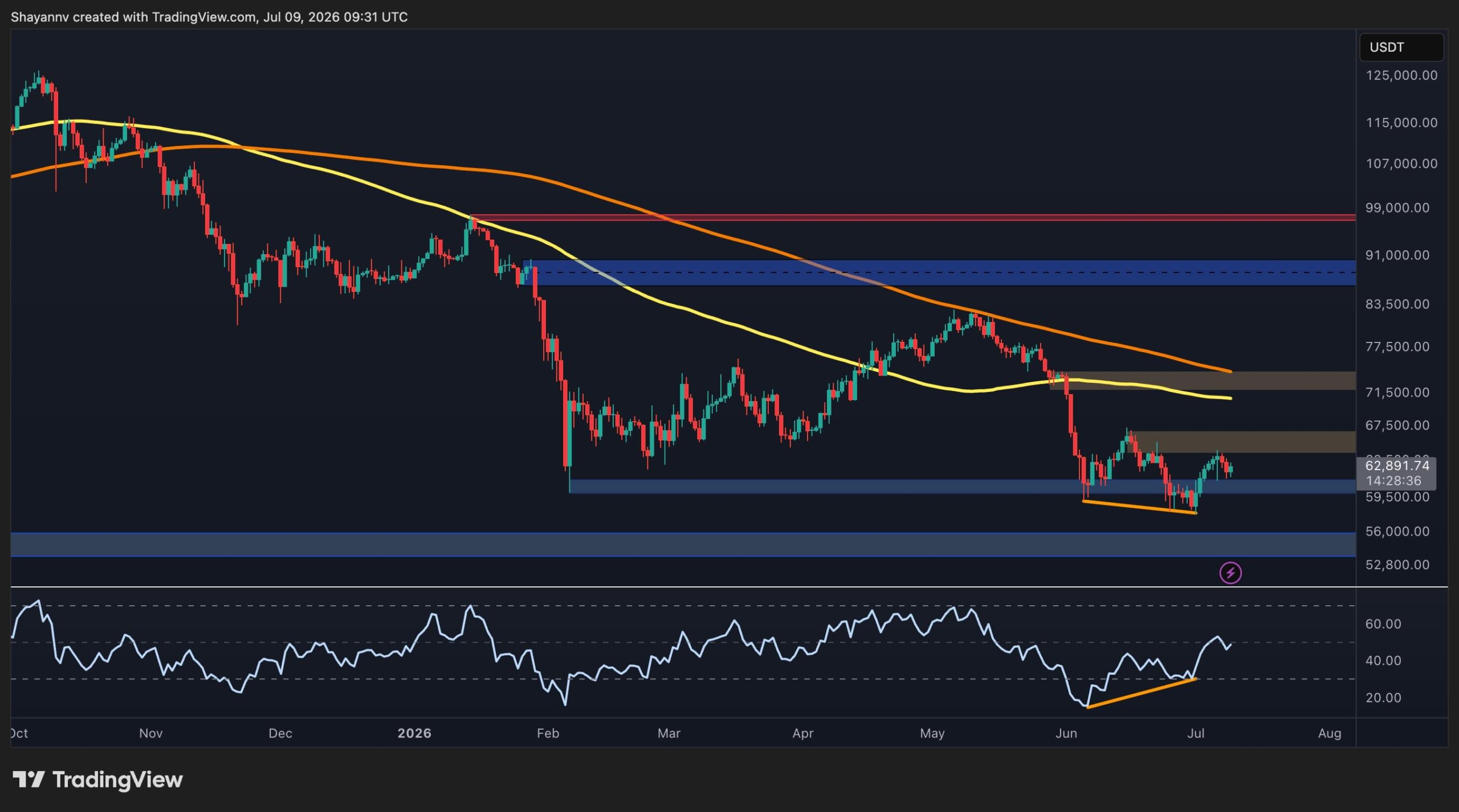
Bitcoin Price Analysis: Has BTC Cleared the Danger Zone After $64K Surge?
Despite showing signs of short-term stabilization above a major support zone, Bitcoin’s downtrend might not be over yet. While momentum has improved on lower timeframes
JPMorgan Says Bitcoin’s Bigger Risk Is Permissioned Blockchains
JPMorgan says Bitcoin's biggest long-term risk isn't Strategy selling BTC—it's the rise of permissioned blockchains that could bypass public chains and crypto
Related Articles
View More
Does XRP Burn Coins? Yes, but Not for the Reason You Think
If you've been holding XRP or thinking about buying it, you've probably seen people arguing about "XRP burns" and wondered what all the fuss is about. The short answer: yes, XRP burns coins — a tiny a

Is XRP Going to Go Up? The Honest Answer No One Gives You
Sooner or later, almost every XRP holder types the same question into a search bar: is XRP going to go up?Here's the honest problem with that question — anyone who answers it with a confident yes and

Can XRP Reach $1,000? The Math Says No, Here's Why
Every crypto rally brings the same question back: can XRP reach $1,000?It is one of the most-searched price targets in all of crypto, and the short answer is no — not at anything close to XRP's curren